
First of all, let’s have a look at the issue by checking out the following example. It’s a simple page with 2 absolutely positioned boxes in the top left corner (.top) and the right bottom corner (.bottom). These boxes are wrapped within an element (.container) with a width of 100vw and a height of 100vh. You may have something similar in your project, such as a fullscreen modal/lightbox with a header/footer.
<!DOCTYPE html>
<html>
  <head>
    <meta charset="utf-8">
    <meta name="viewport" content="width=device-width, initial-scale=1">
  </head>
  <body>
    <div class="container">
      <div class="top">
        1<br>2<br>3<br>4<br>5<br>6<br>7<br>8<br>9<br>10
      </div>
      <div class="bottom">
        1<br>2<br>3<br>4<br>5<br>6<br>7<br>8<br>9<br>10
      </div>
    </div>

    <style>
    *,
    *:before,
    *:after {
      box-sizing: border-box;
      margin: 0;
      padding: 0;
      border: 0;
    }

    .container {
      position: relative;
      width: 100vw;
      height: 100vh; /* This is where it gets interesting */
    }

    .top {
      position: absolute;
      top: 0;
      left: 0;
      border: 1px solid red;
    }

    .bottom {
      position: absolute;
      bottom: 0;
      right: 0;
      border: 1px solid blue;
    }
    </style>
  </body>
</html>
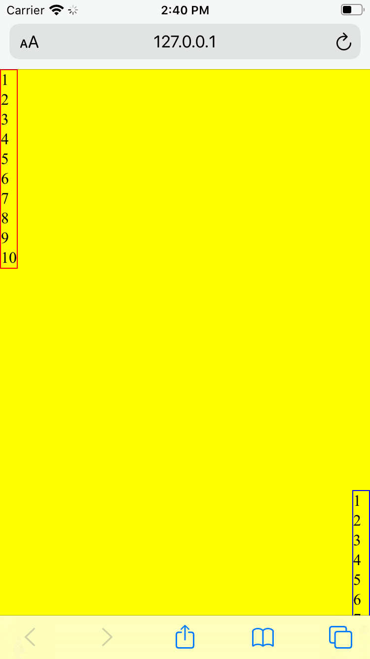
This should span accross the full viewport, right? Well, in the left screenshot below, you can see that in iOS Safari the bottom navigation bar actually overlaps your content, i.e. your content is below the »fold«—although you may have expected that it’s not part of the viewport.
In the right screenshot, you can see how one would expect the layout to be. The container spans between the top address bar and the bottom navigation bar.

This is a well-known issue and unfortunately intentional, as it prevents other problems, as Benjamin Poulain explained in his reply to a WebKit bug ticket regarding this issue.
This is completely intentional. It took quite a bit of work on our part to achieve this effect.
The base problem is this: the visible area changes dynamically as you scroll. If we update the CSS viewport height accordingly, we need to update the layout during the scroll. Not only that looks like shit, but doing that at 60 FPS is practically impossible in most pages (60 FPS is the baseline framerate on iOS).
It is hard to show you the "looks like shit" part, but imagine as you scroll, the contents moves and what you want on screen is continuously shifting.
Dynamically updating the height was not working, we had a few choices: drop viewport units on iOS, match the document size like before iOS 8, use the small view size, use the large view size.
From the data we had, using the larger view size was the best compromise. Most website using viewport units were looking great most of the time.
So, it’s not a bug—and no fix is planned for this.
Solutions
Luckily, this doesn't have to be the most depresssing answer ever. How do we go on from this? There’s a couple of solutions.
100%
Depending on your use case, it may be enough to simply use 100% instead of 100vh, especially for fixed/sticky elements (as 100% will be relative to the »real« viewport).
However, if your element is nested somewhere in the DOM, this may not work out (as 100% will be relative to the parent elements which are only as tall as the content they contain). And that may have been the motivation why you wanted to use 100vh in the first place.
stretch / -webkit-fill-available
Intrinsic and extrinsic sizing is a new CSS functionality that extends the sizing properties with keywords that represent content-based »intrinsic« sizes and context-based »extrinsic« sizes. This allows CSS to more easily describe boxes that fit their content or fit into a particular layout context.
One of these keywords is stretch which formerly was known as fill, fill-available, and its prefixed spin-offs -moz-available and -webkit-fill-available. We can make use of this functionality and because CSS skips over style declarations it doesn’t understand, we can implement fallbacks for all of these possible implementations.
.container {
  height: 100%; /* Fallback */
  height: -moz-available;
  height: -webkit-fill-available;
  height: fill-available;
  height: stretch; /* Latest specification */
}
(Hint: Autoprefixer will compile stretch to -webkit-fill-available and -moz-available automatically.)
JavaScript
JavaScript is always the »last stronghold« for stuff that’s not possible with pure CSS. Using CSS variables, you can pass the value of window.innerHeight into your CSS and update this variable every time the viewport is resized.
const updateViewportHeight = () => {
  document.documentElement.style.setProperty('--viewport-height', `${window.innerHeight}px`);
};

window.addEventListener('resize', updateViewportHeight);

updateViewportHeight();
In your CSS, you can consume this variable as follows.
:root {
   --viewport-height: 100%;
}

.container {
  height: 100vh;

  @supports (height: var(--)) {
    height: var(--viewport-height);
  }
}
If you can’t use CSS variables in your project (e.g. due to browser support concerns), you can also update the height of your affected elements directly from within your script.
const container = document.querySelector('.container');

const updateViewportElements = () => {
  container.style.height = `${window.innerHeight}px`;
};

window.addEventListener('resize', updateViewportElements);

updateViewportElements();
Conclusion
Unfortunately, there isn’t a one-size-fits-all solution for this issue. You should try the aforementioned solutions top down and be very conscientious with your cross-browser/cross-device testing.