
Web Components are a collection of different standards which allow building encapsulated and reusable components. Technically, they are based primarily on the Custom Elements interface for defining user-defined HTML elements and the Shadow DOM interface for encapsulating element content to prevent it from being influenced by external factors like CSS.
While this makes it possible to implement a component architecture without the need for a framework or library such as React, you still may want/need to stick to these frameworks and libraries for the application itself and instead facilitate Web Components concepts such as Custom Elements and Shadow DOM for wrapping the React application.
Wrapping React into a native Web Component
The following example shows how the main React application can be wrapped.
import React from 'react';
import ReactDOM from 'react-dom';
import App from './App';
const getMountPoint = (): HTMLDivElement => {
const mountPoint = document.createElement('div');
mountPoint.className = 'demo-application';
return mountPoint;
};
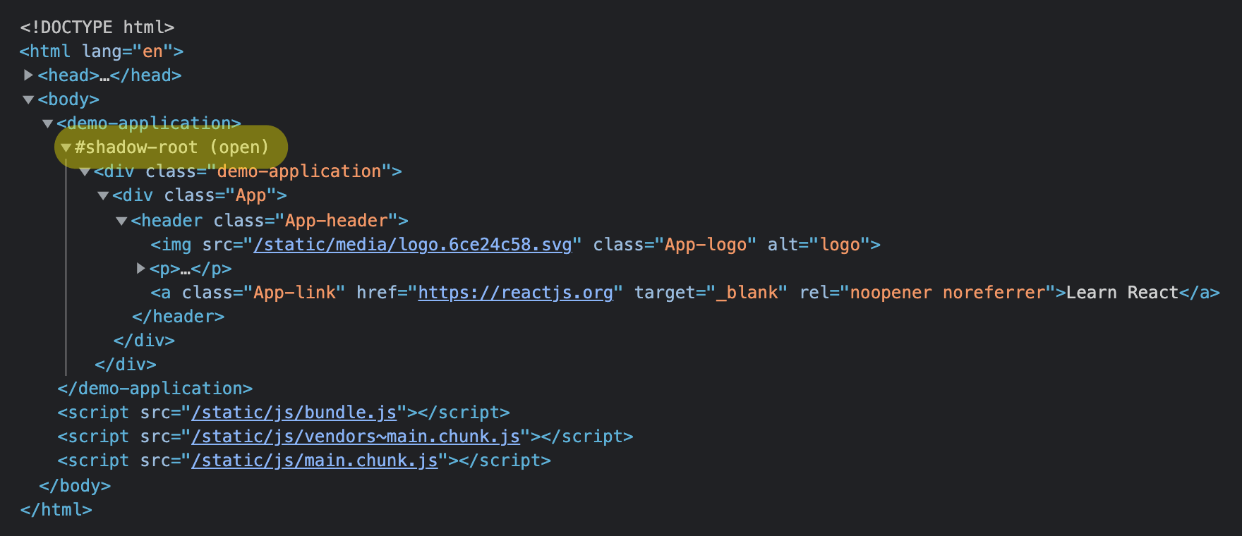
class DemoApplication extends HTMLElement {
connectedCallback() {
const shadowRoot = this.attachShadow({
mode: 'open',
});
const mountPoint = getMountPoint();
shadowRoot.appendChild(mountPoint);
ReactDOM.render(
<React.StrictMode>
<App />
</React.StrictMode>,
mountPoint,
);
}
}
customElements.define('demo-application', DemoApplication);
First, the DemoApplication class and custom element demo-application (which is based on that class) are defined. In addition, a custom mount point is created and appended to the component’s shadow root. This mount point element is necessary for the main change: switchting the container element of ReactDOM’s render method so React is rendering into the Web Component’s Shadow DOM instead of the main DOM. (The mount point’s class name demo-application is just for debugging purposes and technically not necessary.)
Now, the custom element can be used via <demo-application></demo-application>.
(While the example above is using TypeScript, you may face issues when using Babel and having classes transformed by Babel. To fix this, you should have a look at the custom elements ES5 adapter and include it before you load your components.)
Fixing missing/broken styling in Shadow DOM
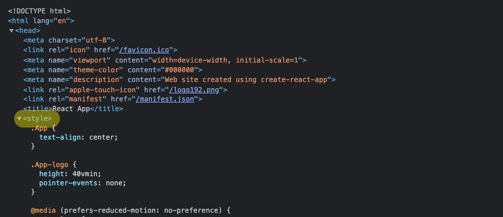
Looking at the rendered application from a visual perspective, you’ll notice that the styling seems to be broken and completely missing.

This is caused by the styles being loaded/injected in the main DOM. Due to Shadow DOM being used by the application, these global styles are not inherited/used within the Shadow DOM, which may be exactly the reason why you switched to Shadow DOM in the first place: to encapsulate your application and protect it from bleeding styles from other applications.
To fix this, you need to adjust how styles are injected and/or loaded. »Create React App« uses style-loader (for development and hot module replacement) and mini-css-extract-plugin (for production builds), so we need to adjust the Webpack configuration used by CRA. To do so, we can use @craco/craco to apply the customizations without using eject.
The following craco.config.js implementes the necessary adjustments for both development and production.
module.exports = {
  webpack: {
    configure: (/** @type import('webpack').Configuration */ webpackConfig) => {
      const styleLoaderConfig = {
        loader: 'style-loader',
        options: {
          injectType: 'singletonStyleTag',
          insert: function insertAtTop(element) {
            window.setTimeout(function() {
              var instance = document.querySelector('demo-application');
              instance.shadowRoot.appendChild(element);
            });
          },
        },
      };

      for (const rule of webpackConfig.module.rules) {
        if (rule.oneOf && Array.isArray(rule.oneOf)) {
          for (const subRule of rule.oneOf) {
            const pattern = (subRule.test || '').toString();
            if (
              [
                /\.css$/.toString(),
                /\.(scss|sass)$/.toString(),
                /\.module\.css$/.toString(),
                /\.module\.(scss|sass)$/.toString(),
              ].includes(pattern)
            ) {
              subRule.use = subRule.use.filter(item => {
                if (typeof item === 'string') {
                  // Dev Mode
                  return !item.includes('style-loader');
                } else if (item.loader) {
                  // Build Mode
                  return !item.loader.includes('mini-css-extract-plugin');
                }
                return true;
              });
              subRule.use.unshift(styleLoaderConfig);
            }
          }
        }
      }

      return webpackConfig;
    },
  },
};
The important change here is styleLoaderConfig and the custom insert function. As this function won’t be transpiled to run in the browser and gets simply stringified and executed in the client, you need to make sure to write browser-compatible JavaScript in here (e.g. var instance instead of const instance). The function queries the main DOM for an instance of the Custom Element demo-application and then appends the consolidated <style> element to its shadow root. For this to work, it’s essential to keep the Shadow DOM open (i.e. mode: 'open' instead of mode: 'closed' in the attachShadow call above).
That custom style-loader configuration then is prepended to all Webpack rules that are loading/transforming CSS, SCSS, and Sass files. Identifying the styling rules is, unfortunately, the ugly part. In the case above, we’re checking the test statement of each and every Webpack rule.
Now, when using craco start (instead of react-scripts start) and craco build (instead of react-scripts build), the adjustments are applied, the styling is injected into the Shadow DOM as inline <style> tag, and thus styling works again.
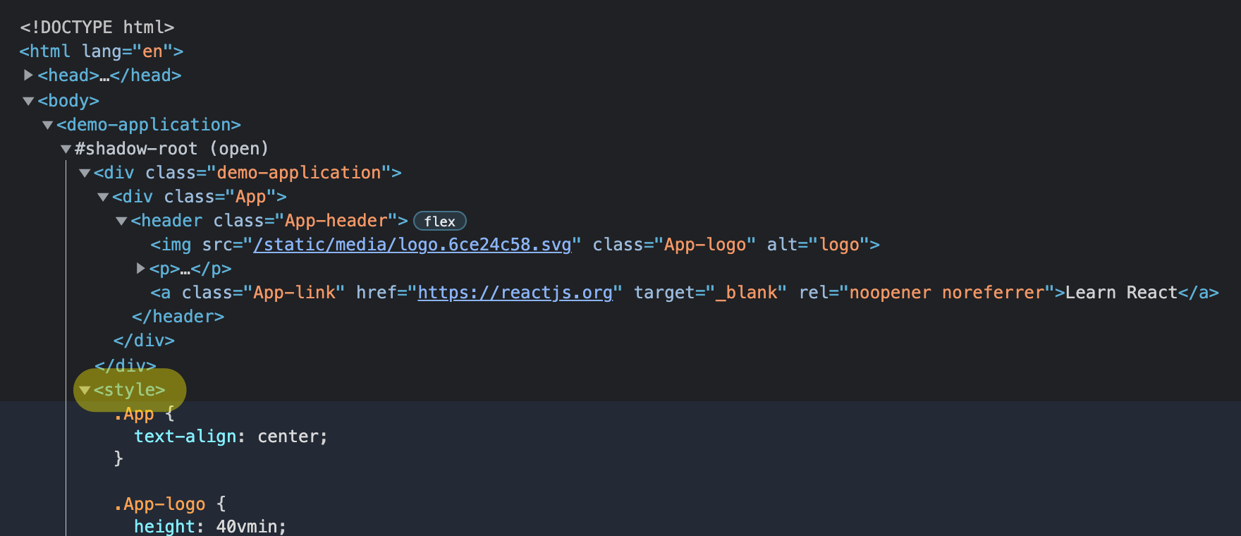
Now, the original styles are back up working in the browser.
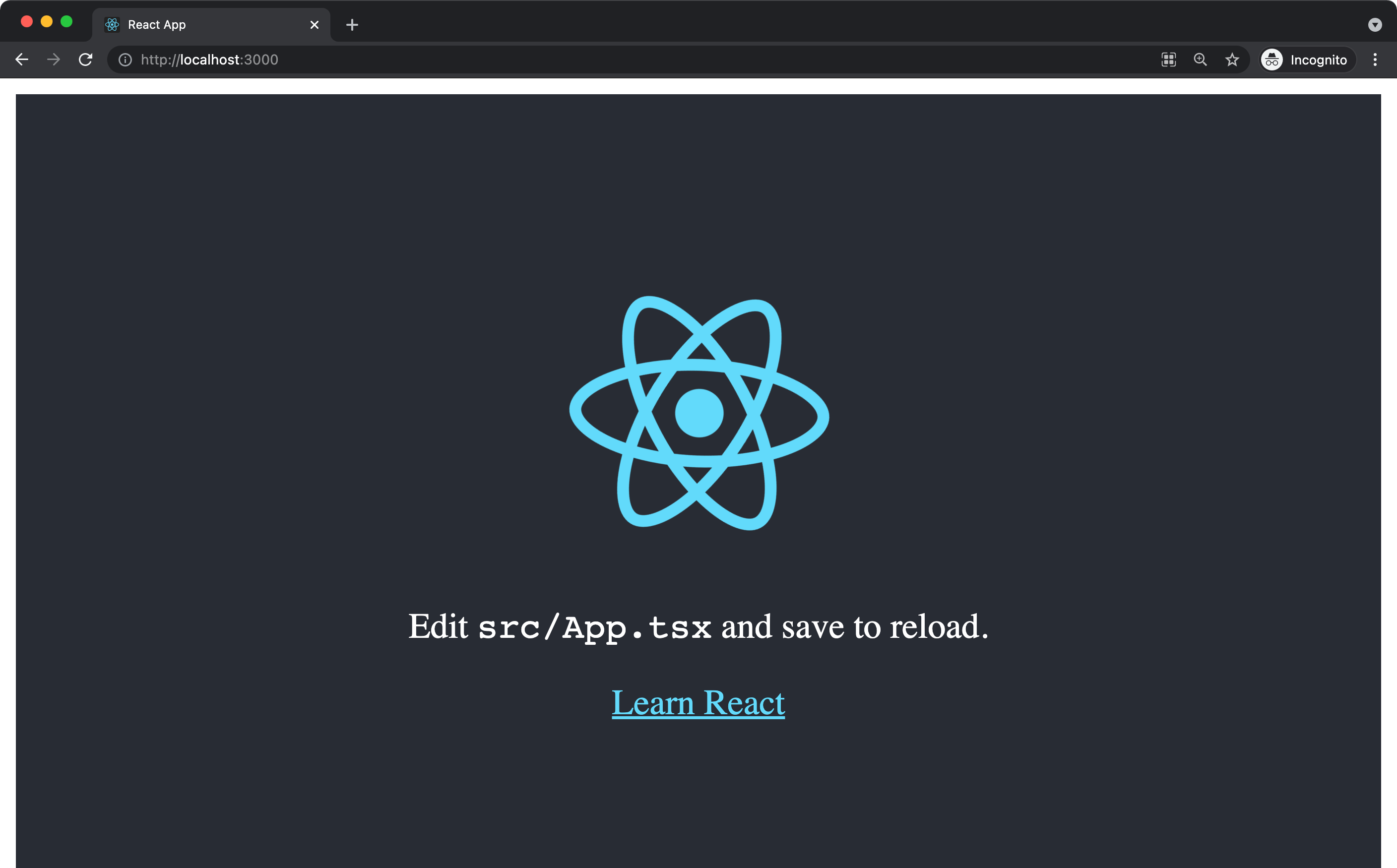
(Again, due to Shadow DOM protecting the DOM from outside styles but also preventing styles within the Shadow DOM from bleeding to the outer main DOM, the styles for body in the React app are not applied, resulting in the white border/margin and default styling for body.)